This tutorial will cover exploring and visualizing data through 2018 for the Minneapolis, MN bike sharing service NiceRide. Part of what makes R incredible is the number of great packages. Part of what makes packages like ggmap and gganimate great is how they build on existing packages.
First step, as always, is to include the libraries we will be using.
1 2 3 4 5 6 7 8 9 10 11 12 13 14 15 16 17 18 19 20 21 22 | # The Usual Suspects library(ggplot2) library(ggthemes) library(dplyr) library(magrittr) library(data.table) library(stringr) # Fetching library(rvest) # Cleaning column names library(janitor) # Date/Time formatting library(lubridate) # Maps library(sf) library(ggmap) # Used for animated density plots library(gganimate) # Only needed for interactive maps library(leaflet) library(leaflet.extras) |
Fetching the Data (Fail)
First we are going to cover how I would normally approach fetching tables like the ones shown on https://s3.amazonaws.com/niceride-data/index.html.
This approach did not work.
1 2 3 4 5 6 | url <- "https://s3.amazonaws.com/niceride-data/index.html" repo <- url %>% read_html tbls <- html_nodes(repo, "table") # Shows all tables tbls |
This is where we learn the approach didn’t work. Calling tbls gives us this return
1 2 3 | {xml_nodeset (1)} [1] <table class="hide-while-loading table table-striped">... |
Since there is only one table we would normally be able to use the html_tables function from rvest and have a nice data frame.
1 2 3 4 | df <- html_table(tbls[1],fill = T)[[1]] nrow(df) # [1] 0 |
Instead, we get the return above, which has been commented out. Zero rows. This is because the data which populates the page is loaded after. There is still hope though.
Fetching the Data (Success)
This is the approach that worked. If we go up one level to https://s3.amazonaws.com/niceride-data/ we can see an xml file which we can use.
1 2 3 4 5 6 7 | url <- "https://s3.amazonaws.com/niceride-data/" repo <- url %>% read_html %>% xml_child(1) %>% xml_child(1) %>% xml_find_all(".//key") # Now we have an xml_nodeset repo[1:10] |
That last bit lets us see a sampling of repo
1 2 3 4 5 6 7 8 9 10 11 12 | {xml_nodeset (10)} [1] <key>201804-niceride-tripdata.csv.zip</key> [2] <key>201805-niceride-tripdata.csv.zip</key> [3] <key>201806-niceride-tripdata.csv.zip</key> [4] <key>201807-niceride-tripdata.csv.zip</key> [5] <key>201808-niceride-tripdata.csv.zip</key> [6] <key>201809-niceride-tripdata.csv.zip</key> [7] <key>201810-niceride-tripdata.csv.zip</key> [8] <key>201811-niceride-tripdata.csv.zip</key> [9] <key>Nice_Ride_data_2010_season.zip</key> [10] <key>Nice_Ride_data_2011_season.zip</key> |
Awesome, this is something we can use.
1 2 3 4 | repo %<>% as_list %>% unlist %>% #Starts with 2018 str_match_all("^2018.*") %>% unlist |
The function as_list is needed because we are converting an xml_nodeset to a vector. We used str_match_all to find files that start with 2018. The %<>% operator passes repo to as_list and also sets repo to the return value of the chain. At this point if you were to call repo you would see the following…
1 2 3 4 5 6 7 8 9 10 | > repo [1] "201804-niceride-tripdata.csv.zip" [2] "201805-niceride-tripdata.csv.zip" [3] "201806-niceride-tripdata.csv.zip" [4] "201807-niceride-tripdata.csv.zip" [5] "201808-niceride-tripdata.csv.zip" [6] "201809-niceride-tripdata.csv.zip" [7] "201810-niceride-tripdata.csv.zip" [8] "201811-niceride-tripdata.csv.zip" |
Downloading and Unzipping
You could merge both actions into one loop, but I made two loops. The %T>% operator comes in handy here to unlink the concatenated filename instead of the return of unzip.
1 2 3 4 5 6 7 8 9 10 11 12 | dir.create("import") # Download Files for(file in repo) { download.file(paste0(url,file),destfile = paste0("import/",file)) } # Unzip for(file in repo) { paste0("import/",file) %T>% unzip(exdir = "import") %>% unlink } |
Read and Merge into a Dataframe
Now that we have the files unzipped we can read them into a list and merge the list into a dataframe. You could do this manually, but this will allow for you to change the year easily, or merge 2018 and 2017 into a dataframe to company ridership between years.
1 2 3 4 5 6 7 | # Read and merge import <- lapply("./import" %>% list.files, function(name) { return(read_csv(paste0("./import/",name))) }) rides <- rbindlist(import,fill = T) rides %<>% clean_names(case = "snake") |
Additional Columns
Now that we have the data in rides, we can build some extra columns/features. Age is a much more intuitive field than birth_year, and grouping ages into bins will come in handy later.
1 2 3 4 5 6 | rides$age <- 2019-rides$birth_year rides$age_bin <- rides$age %>% .bincode(seq(0,120,20)) rides$age_bin <- sapply(rides$age_bin,function(bin) { return(paste0((bin-1)*20,"-",(bin*20)," Years Old")) }) |
We probably will want to see things in a more macro level view, so we should build out some date/time columns as well.
1 2 3 4 5 6 7 8 9 10 11 12 13 14 15 16 17 18 | # Trip times rides$minutes <- rides$tripduration/60 rides$hours <- rides$tripduration/60/60 # Start times rides$start_hour <- lubridate::hour(rides$start_time) rides$mm <- hour(rides$start_time)*60 + minute(rides$start_time) rides$start_day <- wday(rides$start_time,label = T, abbr = F, week_start = 1) # Weekend/Weekday rides$start_day_type <- ifelse(wday(rides$start_time, week_start = 1)>5, "Weekend", "Weekday") # Week of year rides$week <- week(rides$start_time) # Month (1-12) rides$month <- month(rides$start_time,label = T,abbr = F) # Month (January-December) rides$month_text <- month(rides$start_time,label = T,abbr = F) # Remove unused levels from factor rides$month_text <- droplevels(rides$month_text) |
Some Tables for Context
You can print the info in a different way, I am just doing this to format everything better for the web.
1 2 3 4 | table(rides$age_bin) %>% lapply({ . %>% format(big.mark=",") %>% return }) |
1 2 3 4 5 6 7 8 9 10 11 12 13 14 15 16 17 18 19 | $`0-20 Years Old` [1] 1.43 $`100-120 Years Old` [1] 0 $`20-40 Years Old` [1] 35.39 $`40-60 Years Old` [1] 58.25 $`60-80 Years Old` [1] 4.82 $`80-100 Years Old` [1] 0.1 |
From this we can see that tossing out anything below a half a percent would remove 80-100 and 100-120. We could probably remove 0-20 as well, but that is up to you.
The Delicious Part
Now comes the time to visually explore the data. For the same of simplicity I am just using theme_fivethirtyeight() and scale_.*_viridis.*() for the theme and colors of most of these plots.
Visualizing Ridership by Month
1 2 3 4 5 | ggplot(data=rides[which(rides$age<=60),], aes(x=week, fill= month_text)) + geom_histogram(alpha=.9) + theme_fivethirtyeight() + ggtitle("Ride Frequency by Week of Year") + facet_grid(vars(usertype), vars(age_bin)) + scale_fill_viridis_d() ggsave(filename = "ride-frequecy-histogram.png",width = 8,units = "in") |
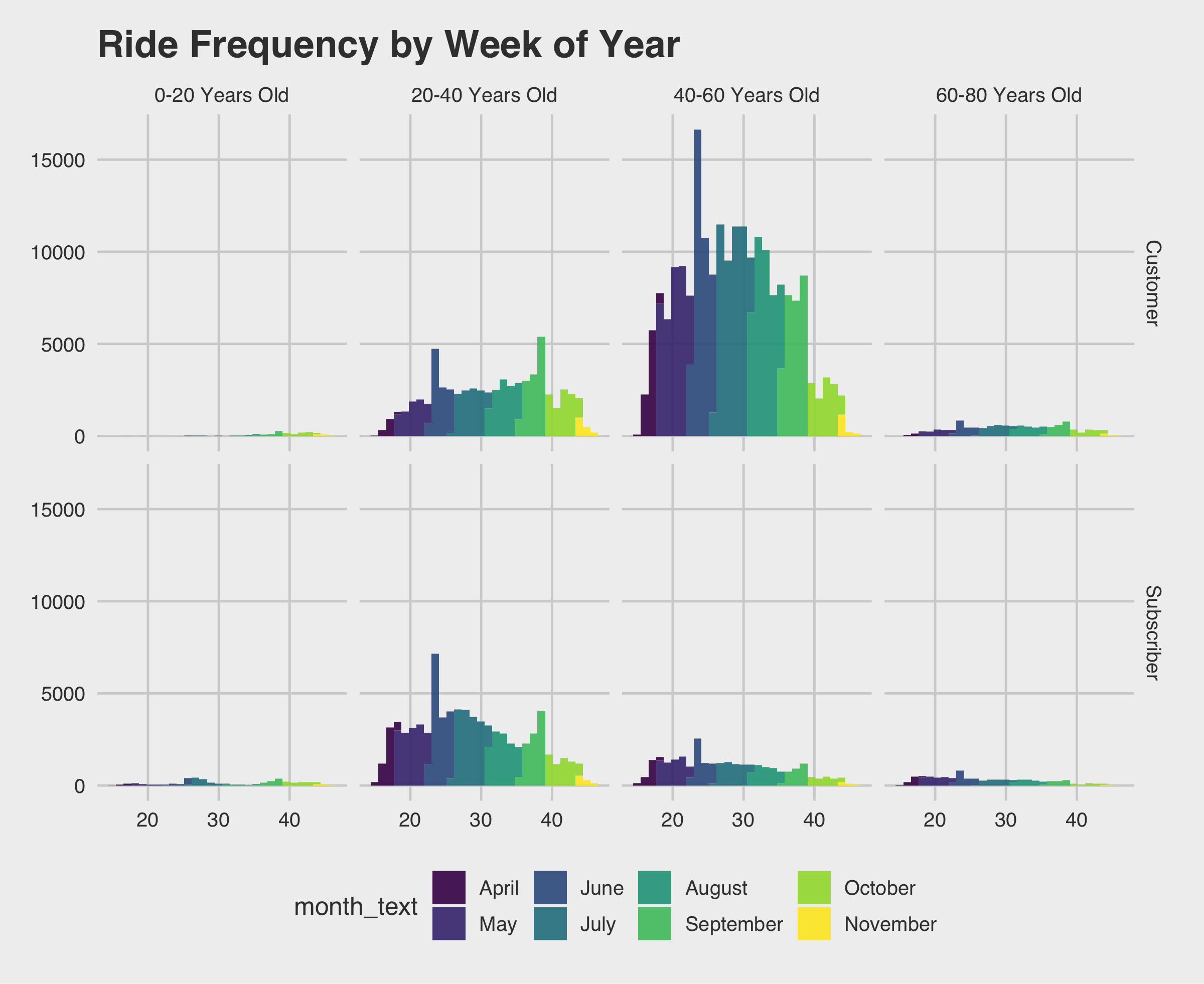
The first thing I notice is the 0-20 and 60-80 year old frequencies are so low they are nearly impossible to identify from this plot. If we want to learn what week of the year people are riding a density plot might work better. There is probably a better way to do this, but in order to get the red line I added an additional layer.
1 2 3 4 5 6 | ggplot(data=rides[which(rides$age<=80),], aes(x=week, fill= age_bin)) + geom_histogram(alpha=.9,aes(y=..density..)) + theme_fivethirtyeight() + ggtitle("Ride Distribution by Week of Year") + geom_density(alpha=0,color=rgb(1,0,0,.4)) + facet_grid(vars(usertype), vars(age_bin)) + scale_fill_viridis_d() ggsave(filename = "ride-frequency-density.png",width = 8,units = "in") |
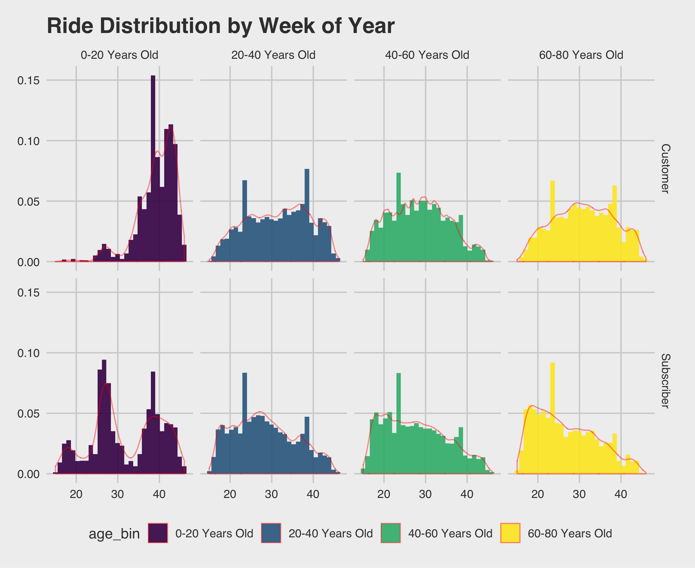
Looks like we are seeing a downward trend toward the end of the year for subscribers/20-80 and customers/20-80 with the biggest downward trends for subscribers/60-80. Makes sense, from the previous plot we saw week 40 fell in October and Minneapolis can get chilly.
Visualizing Start Time
I am dumping a big chunk of code here, don’t be alarmed. The first bit of code filters thanks to dplyr and only keeps the more active months. I also filtered out those age bins we talked about earlier. The droplevels() is because ggplot didn’t like when I had unused levels (from the months).
I also added breaks and labels for the time to correspond with peak times.
1 2 3 4 5 6 7 8 9 10 11 12 | ggplot(rides %>% filter(age <= 80, month > 4, month < 10) %>% droplevels(), aes(x=mm, fill= age_bin)) + geom_density(alpha=.6) + scale_x_continuous(labels = c("5am","8am","1:30pm","5pm","8pm"), breaks = c(300,480,750,1020,1200)) + labs(fill="",title="NiceRide 2018 Start Times") + theme_fivethirtyeight() + theme(strip.background = element_rect(fill = "#FFFFFF")) + facet_grid(vars(usertype), vars(start_day_type)) + scale_fill_viridis_d(option="A") |
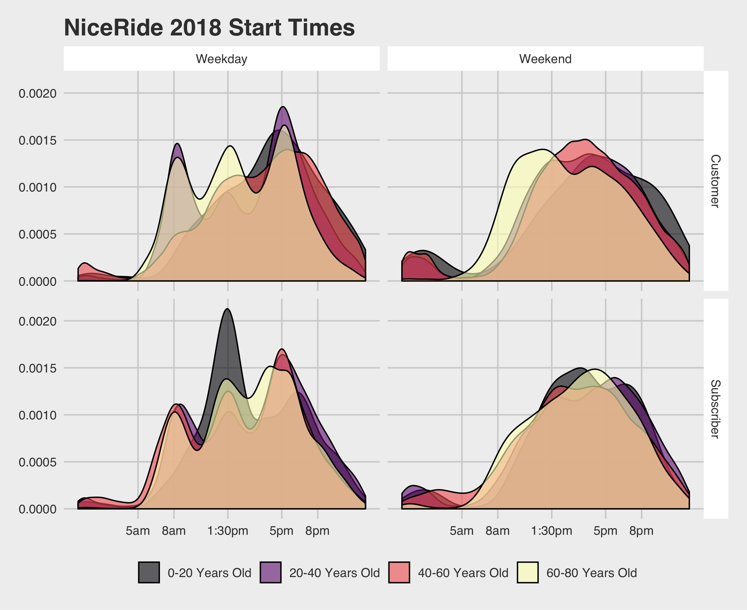
This plot gives us a lot of really interesting information! You can see how NiceRide is used by many people who are presumably commuting. There is also a lunch rush for NiceRide bikes.
Maps!
So far all of this information has been on a macro level for time based ridership. Now we will switch to location based ridership.
Static Network Map
In order to generate static heatmaps we will be using the ggmap package along with the ggplot2::geom_segment() function. There is also a ggplot2::geom_curve() function which you can use to generate curved line segments. For the curved line segments you must also use coord_cartesian()
In order to speed up the rendering of geom_segment() I aggregated the data and then scaled the opacity of the line segments. I don’t think this was a necessary step, but it made rendering (and tweaking the plot) much easier.
1 2 3 4 5 6 7 8 9 | df.lines <- rides %>% group_by(start_station_longitude, start_station_latitude, end_station_longitude, end_station_latitude, start_station_name, end_station_name) %>% summarize(rides = n()) |
Now we have a handy dandy dataframe which has the number of rides between stations. The start_station_name and end_station_name are not required, but they are helpful if you want to further explore station data. You can also summarize on the fly for station information with plyr
1 2 3 4 5 | rides %>% group_by(start_station_name,end_station_name) %>% filter(start_station_name!="NULL") %>% summarize(rides = n()) %>% ungroup %>% top_n(10) |
1 2 3 4 5 6 7 8 9 10 11 12 13 14 15 | Selecting by rides # A tibble: 10 x 3 start_station_name end_station_name rides <chr> <chr> <int> 1 100 Main Street SE 100 Main Street SE 1161 2 11th Ave S & S 2nd Street 11th Ave S & S 2nd Street 1436 3 6th Ave SE & University Ave 6th Ave SE & University Ave 1148 4 Lake Calhoun Center Lake Calhoun Center 2804 5 Lake Como Pavilion Lake Como Pavilion 2070 6 Lake Harriet Bandshell Lake Harriet Bandshell 2332 7 Lake Street & Knox Ave S Lake Street & Knox Ave S 6852 8 Minnehaha Park Minnehaha Park 1673 9 W 36th Street & W Calhoun Parkway W 36th Street & W Calhoun Parkway 2012 10 Weisman Art Museum Willey Hall 1081 |
Neat, right? Also, that Lake Street & Knox Ave S location had over six thousand round trips. Also pretty interesting that all of the top 10 were round trips except for Weisman Art Museum/Willey Hall. Changing to the top 20 stations we see that pop four times as a starting station.
1 2 3 4 5 6 7 8 9 10 11 12 13 14 15 16 17 18 19 20 21 22 23 24 25 | Selecting by rides # A tibble: 20 x 3 start_station_name end_station_name rides <chr> <chr> <int> 1 100 Main Street SE 100 Main Street SE 1161 2 11th Ave S & S 2nd Street 11th Ave S & S 2nd Street 1436 3 6th Ave SE & University Ave 6th Ave SE & University Ave 1148 4 Harriet Island Harriet Island 970 5 Hiawatha Ave & E 50th Street Hiawatha Ave & E 50th Street 827 6 Lake Calhoun Center Lake Calhoun Center 2804 7 Lake Calhoun Center Lake Street & Knox Ave S 864 8 Lake Como Pavilion Lake Como Pavilion 2070 9 Lake Harriet Bandshell Lake Harriet Bandshell 2332 10 Lake Nokomis Lake Nokomis 1059 11 Lake Street & Knox Ave S Lake Calhoun Center 777 12 Lake Street & Knox Ave S Lake Harriet Bandshell 741 13 Lake Street & Knox Ave S Lake Street & Knox Ave S 6852 14 Lake Street & Knox Ave S W 36th Street & W Calhoun Parkway 757 15 Minnehaha Park Minnehaha Park 1673 16 W 36th Street & W Calhoun Parkway Lake Street & Knox Ave S 826 17 W 36th Street & W Calhoun Parkway W 36th Street & W Calhoun Parkway 2012 18 Weisman Art Museum Social Sciences 795 19 Weisman Art Museum Willey Hall 1081 20 Willey Hall Weisman Art Museum 1036 |
Getting the Base Map
The package ggmap has a function called get_map() which we will be using. You can pass the name of the city, but I am passing the boundaries of our start/end coordinates.
1 2 3 4 5 6 7 8 | # First you will need a Google API Key register_google(key = "YOUR_API_KEY") mpls <- get_map(c(left = min(rides$start_station_longitude), bottom = min(rides$start_station_latitude), right = max(rides$start_station_longitude), top = max(rides$start_station_latitude)), maptype='terrain', source='stamen', zoom=13) |
Now that we have our city mpls tiles, we can add some layers, including our geom_segment() layer. The function scale_alpha() was a lifesaver here, and without that we wouldn’t have been able to aggregate our data in df.line as the whole plot would be either blacked out when using aes() or not determined by df.line$rides. The function theme_nothing() comes from ggmap and is useful for removing axis labels among other attributes.
1 2 3 4 5 6 7 8 9 10 11 12 13 14 15 16 17 18 19 20 21 22 23 24 | # Darken allows us to lighten up the map ggmap(mpls,darken = c(.8,"#FFFFFF")) + geom_segment(data = df.lines, aes(x = start_station_longitude, y = start_station_latitude, xend = end_station_longitude, yend = end_station_latitude, alpha = sqrt(rides)), color = "#000000") + coord_cartesian() + scale_alpha(range = c(0.0001, .5)) + geom_point(data = df.lines %>% group_by(longitude = start_station_longitude, latitude = start_station_latitude) %>% summarize(rides = sum(rides)), aes(x = longitude, y = latitude, size = rides), color="#009900",alpha=.4) + scale_size_continuous(range(4,100)) + scale_color_viridis_c() + scale_fill_viridis_c() + theme_nothing() ggsave(filename = "station-network.jpg",width = 8,units = "in") |
I made the executive decision to aggregate data for geom_point() on the fly. Without aggregating, we would be left with multiple points for each start station.
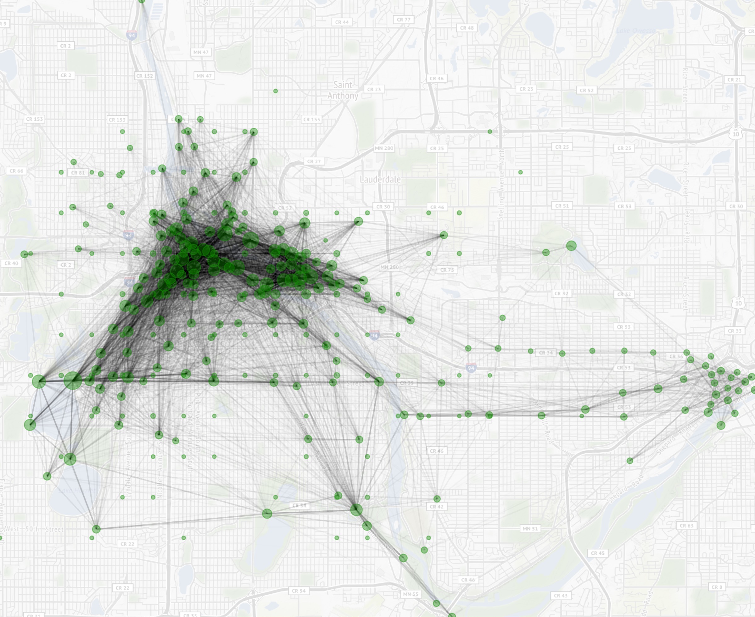
Some of those roundtrips threw off the scale, which is why sqrt() is used. You could substitute sqrt() for log(), but I found the results more palatable as written.
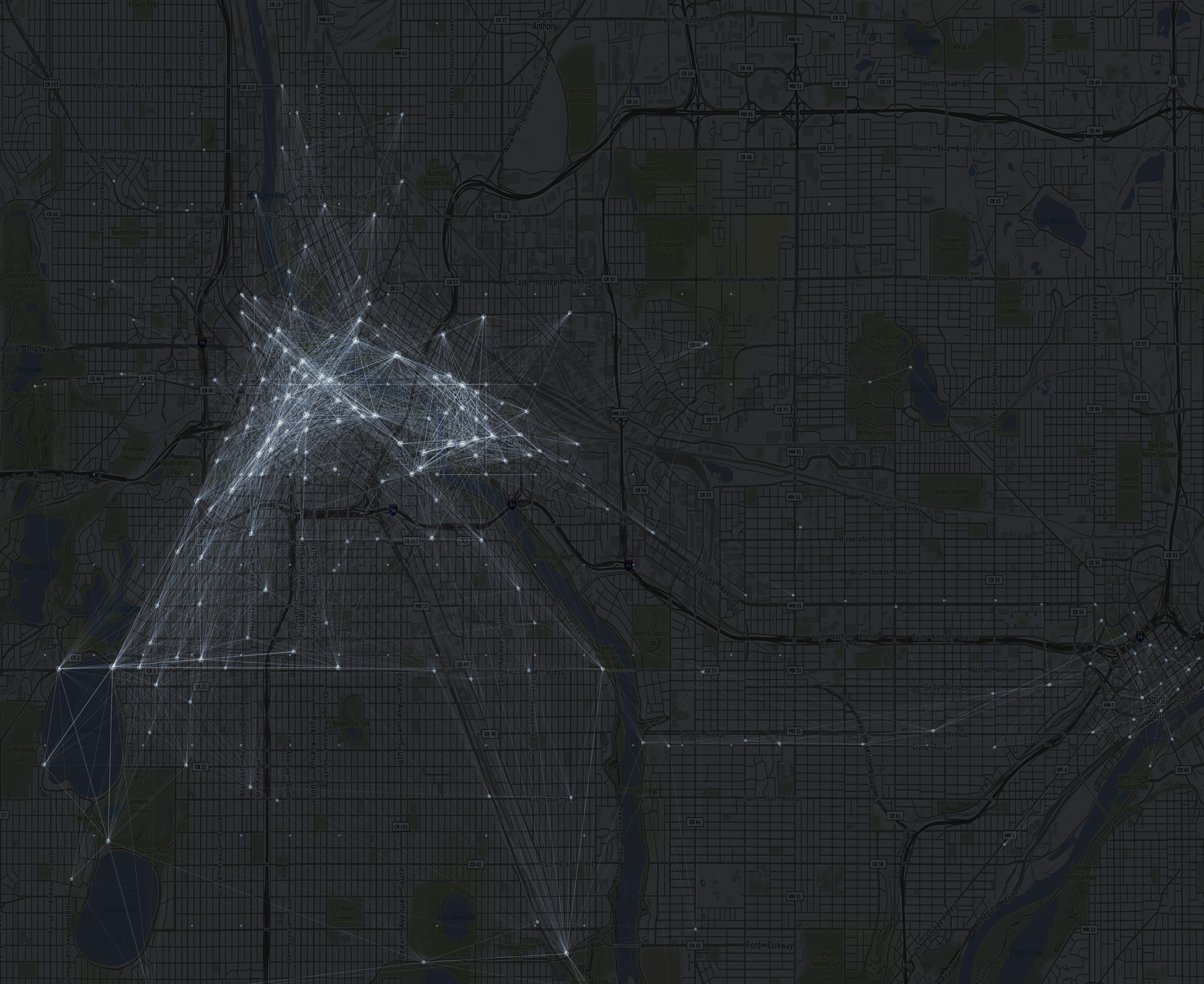
There are a couple of insights to be garnered from this plot. There is a nice little rectangle of trips down at the bottom along Minnehaha Creak, the chain of lanes, and then on Lake Street and either West River Parkway or Hiawatha. There is also a ton more activity in Minneapolis than St. Paul, as expected. This might also be a good reference for where to put additional NiceRide stations. You may want to first replace geom_segment() with geom_path() from the ggmap::route() function which I will go over in another, shorter tutorial.
Leaflet Interactive Map
This one also required a new dataframe. Essentially we are summarizing the start stations and end stations separately so we can see if there is a change in the heatmap when cycling between the two layers.
1 2 3 4 5 6 7 8 9 10 11 12 13 14 15 16 | df.heatmap.start_end <- list() df.heatmap.start_end$start <- rides %>% group_by(start_station_longitude, start_station_latitude) %>% summarize(intensity = sqrt(n())) names(df.heatmap.start_end$start)[1:2] <- c("longitude","latitude") df.heatmap.start_end$end <- rides %>% group_by(end_station_longitude, end_station_latitude) %>% summarize(intensity = sqrt(n())) names(df.heatmap.start_end$end)[1:2] <- c("longitude","latitude") df.heatmap.start_end$start$pos <- "Start" df.heatmap.start_end$end$pos <- "End" df.heatmap.start_end %<>% rbindlist(fill = T) |
Hot Hot Heat
You don’t have to add two layers of heatmaps, but you can! I segmented the data between start and stop to see if there was any change. The function addLayersControl() will allow us to toggle between the two layers. You can tweak the parameters to your liking, but I found these settings produced a plot I was happy with.
1 2 3 4 5 6 7 8 9 10 11 12 13 14 15 16 17 18 19 20 21 | leaflet(df.heatmap.start_end) %>% addProviderTiles(providers$CartoDB.DarkMatter) %>% addHeatmap(data = df.heatmap.start_end %>% filter(pos=="Start"), lng=~longitude, lat=~latitude, intensity = ~intensity, blur = 10, max = 100, radius = 15, layerId = "Start", group = "Start") %>% addHeatmap(data = df.heatmap.start_end %>% filter(pos=="End"), lng=~longitude, lat=~latitude, intensity = ~intensity, blur = 10, max = 100, radius = 15, layerId = "End", group = "End") %>% addLayersControl( baseGroups = c("Start","End"), options = layersControlOptions(collapsed = FALSE) ) |
There was some change, and it was negligible.
Bonus
1 2 3 4 5 6 7 8 9 10 11 12 13 14 15 16 | library(ggTimeSeries) # Generate frequency table df.cal <- rides$start_time %>% as_date() %>% table %>% data.frame names(df.cal) <- c("Date","Rides") df.cal$Date %<>% as_date ggplot_calendar_heatmap( df.cal, 'Date', 'Rides' ) + theme_fivethirtyeight() + theme(legend.position = "right", legend.direction = "vertical") + scale_fill_viridis_c() ggsave(filename = "ride-calendar.png",width = 8,units = "in") |

Wrap Up
All in all there is a ton of data to go through, and plenty more can be done. Some ideas for those who want to continue this project…
- Compare ridership by years
- Append
rideswith weather information - Determine features with significant deviation
- Use
geom_path()and map suggested bike routes - Create static heatmaps using 2d density plots
- Calendar Views

Very nice post! good work on the analysis and visualizations.
What are the spikes in the ride frequency at June? (week 25 I think) and September (week 38)?
P.S.: Axis titles!!!
Hello,
I’ve got an error message when I run the below code.
————————————————————————
ggplot(rides %>% filter(age 4,
month % droplevels(),
aes(x=mm, fill= age_bin)) +
geom_density(alpha=.6) +
scale_x_continuous(labels = c(“5am”,”8am”,”1:30pm”,”5pm”,”8pm”),
breaks = c(300,480,750,1020,1200)) +
labs(fill=””,title=”NiceRide 2018 Start Times”) +
theme_fivethirtyeight() +
theme(strip.background = element_rect(fill = “#FFFFFF”))+
facet_grid(vars(usertype), vars(start_day_type)) + scale_fill_viridis_d(option=”A”)
What was the error message? Did you make sure you have all of the libraries loaded?
Hi All,
I also got an error message at this chunk, it was this one:
> ggplot(rides %>% filter(age 4,
+ month % droplevels(),
+ aes(x=mm, fill= age_bin)) +
+ geom_density(alpha=.6) +
+ scale_x_continuous(labels = c(“5am”,”8am”,”1:30pm”,”5pm”,”8pm”),
+ breaks = c(300,480,750,1020,1200)) +
+ labs(fill=””,title=”NiceRide 2018 Start Times”) +
+ theme_fivethirtyeight() +
+ theme(strip.background = element_rect(fill = “#FFFFFF”)) +
+ facet_grid(vars(usertype), vars(start_day_type)) + scale_fill_viridis_d(option=”A”)
Error: Faceting variables must have at least one value
Sounds like you may not have set start_day_type. Try table(rides$start_day_type) and see what you get.
Hi Matt,
thank you for your quick response! I tried your suggestion and here is the result:
> table(rides$start_day_type)
Weekday Weekend
281226 131197
I think it is strange that in the chunck previous to this one
ggplot(data=rides[which(rides$age<=80),], aes(x=week, fill= age_bin)) +
geom_histogram(alpha=.9,aes(y=..density..)) + theme_fivethirtyeight() + ggtitle("Ride Distribution by Week of Year") +
geom_density(alpha=0,color=rgb(1,0,0,.4)) +
facet_grid(vars(usertype), vars(age_bin)) + scale_fill_viridis_d()
ggsave(filename = "ride-frequency-density.png",width = 8,units = "in")
the faceting parameters are exactly the same, and that part of the code runs without any error.
Maybe try removing that facet_grid() line and see what happens. They may just be an error that gets hit before and suppressed. While building the blog post I ran those segments again, so they should work.
Sorry Mat, my last comment on the facet_grid() parameters being exactly the same in the preceding chunk is not correct. I made a mistake in choosing the right chunk to check on, and could not delete the comment once it was posted.
Anyway, I left out the facet_grid() line from the part throwing the error, and now another error pops up:
> ggplot(rides %>% filter(age 4,
+ month % droplevels(),
+ aes(x=mm, fill= age_bin)) +
+ geom_density(alpha=.6) +
+ scale_x_continuous(labels = c(“5am”,”8am”,”1:30pm”,”5pm”,”8pm”),
+ breaks = c(300,480,750,1020,1200)) +
+ labs(fill=””,title=”NiceRide 2018 Start Times”) +
+ theme_fivethirtyeight() +
+ theme(strip.background = element_rect(fill = “#FFFFFF”))
Error in f(…, self = self) : Breaks and labels are different lengths
> #+
> # facet_grid(vars(usertype), vars(start_day_type)) + scale_fill_viridis_d(option=”A”)
Apart from this, I wanted to thank you for the whole code. I find this case to be a beautiful analysis, very useful for my personal development. too.
The problem is the Month value, I changed as this code, it works.
#Visualizing Start Time
df=rides %>% filter(age % droplevels()
ggplot(df,aes(x=mm, fill= age_bin)) +
geom_density(alpha=.6) +
scale_x_continuous(labels = c(“5am”,”8am”,”1:30pm”,”5pm”,”8pm”),
breaks = c(300,480,750,1020,1200)) +
labs(fill=””,title=”NiceRide 2018 Start Times”) +
theme_fivethirtyeight() +
theme(strip.background = element_rect(fill = “#FFFFFF”)) +
facet_grid(vars(usertype), vars(start_day_type)) + scale_fill_viridis_d(option=”A”)