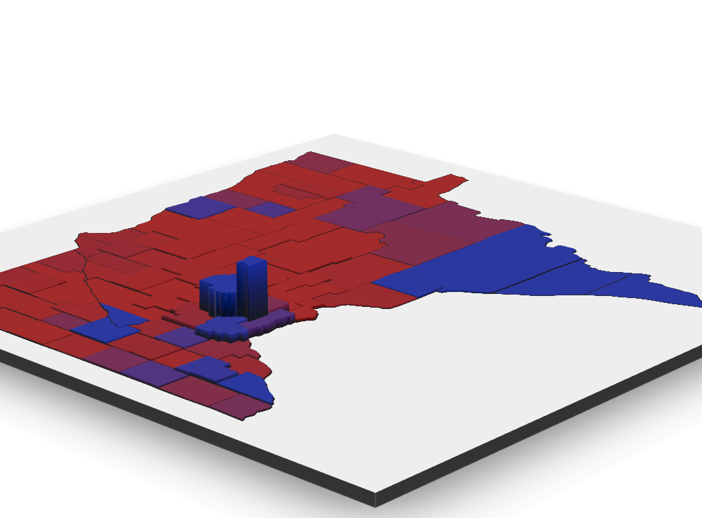
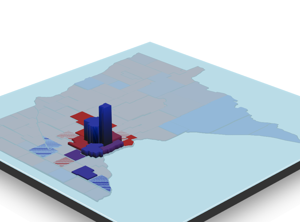
This is going to be a bit longer than some of my previous tutorials as it covers a walkthrough for sourcing data, scraping tables, cleaning, and generating the 3D view below which you can springboard from with the help of the rgl package. The heavy lifting is done with ggplot and rayshader.
Rayshader
rayshader is an open source R package for producing 2D and 3D hillshaded maps of elevation matrices using a combination of raytracing, spherical texture mapping, and ambient occlusion.
This amazing package is what inspired this tutorial. I saw one of the author’s tweets, remembered the 3D map from BlueShift I saw from the 2016 election results.
One thing to keep in mind is this will not be as fast as some other solutions (plotly for example), and the interactive element will likely not be shareable. There is a function called writeWebGL within rgl that I have not had much luck with, but it does exist. Rasyshader allows for creating programatic flyovers and animations though.
The R Script
Including packages
These are the packages I used for the majority of the code. I will include the ones for creating rasters and rayshading later in this write-up.
1 2 3 4 5 6 7 8 9 10 | library(ggplot2) library(ggmap) library(maps) library(mapdata) library(stringr) library(dplyr) library(rvest) library(magrittr) library(ggthemes) |
County Information
This tutorial is for Minnesota, but other regions can be used without changing too much. The biggest difference I noticed was abbreviations for county names.
1 2 3 4 5 6 7 | usa <- map_data("usa") states <- map_data("state") mn_df <- subset(states, region == "minnesota") counties <- map_data("county") mn_county <- subset(counties, region == "minnesota") mn_county$pos <- 1:nrow(mn_county) |
The dataframe mn_county will be reused as the primary dataframe in this tutorial, and will have information from difference sources appended to this dataframe.
Population Information
1 2 3 4 5 | webpage <- read_html("https://en.wikipedia.org/wiki/List_of_counties_in_Minnesota") tbls <- html_nodes(webpage, "table") # Shows all tables tbls |
We only need one table. To determine which table we print out the table. It is the one with sortable in the class name, but there are other ways of determining which one. The results from tbls will give something that looks like this…
1 2 3 4 5 | {xml_nodeset (3)} [1] <table class="wikitable sortable"... [2] <table class="nowraplinks collaps... [3] <table class="nowraplinks collaps... |
To make this easier I just chose to use the first table to read, and used the first element (dataframe) from the html_table return.
1 2 3 4 5 6 7 8 9 10 11 12 13 14 15 16 17 18 19 20 21 22 23 24 25 26 27 28 29 | wiki <- html_table(tbls[1],fill = T)[[1]] # Remove Citations in Column Names names(wiki) <- gsub("\\[.*$","",names(wiki)) # Convert to Numeric and Remove Weird Characters wiki$Population <- wiki$Population %>% gsub("^.*♠","",.) %>% gsub("[^0-9\\.]","",.) %>% as.numeric # Convert to Numeric and Remove Weird Characters wiki$Area <- wiki$Area %>% gsub("^[0-9]+♠","",.) %>% gsub("sq.*$","",.) %>% gsub("[^0-9\\.]","",.) %>% as.numeric # Column not needed wiki$Map <- NULL # Remove " County" from County Names # One off replacement for "saint louis" wiki$County <- gsub("( County|\\.)","",wiki$County) %>% tolower %>% gsub("saint louis","st louis",.) # Just makes it easier to merge later names(wiki)[1] <- "subregion" # Append to mn_county mn_county <- merge(mn_county,wiki,by="subregion",all.x=T) mn_county$density <- mn_county$Population / mn_county$Area # Unused mn_county$bin <- NULL |
The county density is used for our “elevation”.
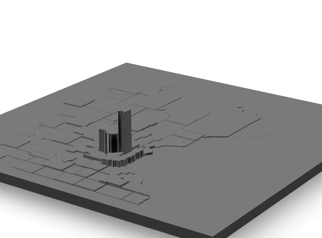
Obviously this isn’t really a worthwhile result yet, but it is getting there. The code for the image above is essentially the same as the code near the end, but with the color layer ommited.
Governor Information
1 2 3 4 5 | webpage <- read_html("https://www.nytimes.com/interactive/2018/11/06/us/elections/results-minnesota-elections.html") tbls <- html_nodes(webpage, "table") # Shows all tables where Walz is matched tbls %>% grep("Walz",.) %>% print() %>% tbls[.] |
This output two different tables that looked similar to the following…
1 2 3 4 5 | [1] 10 11 {xml_nodeset (2)} [1] <table class="eln-table eln-results-table">... [2] <table class="eln-table eln-county-table">... |
We want the second table with county results, which has an actual index of 11 as seen at the top of the output. This might not be the best way, but it is quick. Without the %>% print() %>% we just see [1] or [2], which would give us the wrong table.
1 2 3 4 5 6 7 8 9 10 11 | governer <- html_table(tbls[11],fill = T)[[1]] governer$County %<>% tolower %>% gsub("\\.","",.) governer$Walz %<>% as.character %<>% gsub("\\,","",.) %>% as.numeric governer$Johnson %<>% as.character %<>% gsub("\\,","",.) %>% as.numeric names(governer)[1] <- "subregion" # Merge with mn_county mn_county <- merge(mn_county,governer,by="subregion",all.x=T) # Set the Margins mn_county$margin <- (mn_county$Walz / mn_county$Johnson) %>% -1 |
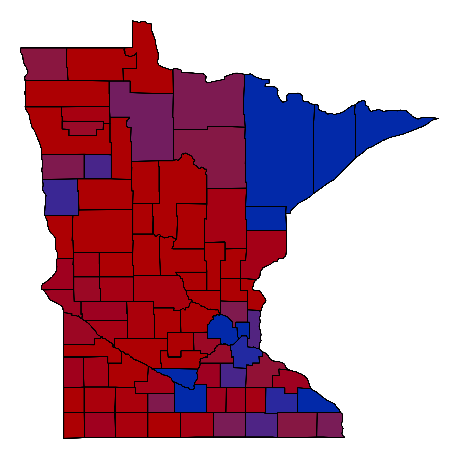
The above was just to get the margins to diverge from 0 (which will be used later for ggplot.
1 2 3 4 5 | > min(mn_county$margin) [1] -0.5754299 > max(mn_county$margin) [1] 1.676873 |
If you were wondering, that ~1.68 came from Ramsey County, voting 170,391 to 63,653 for Walz. The min() came from Morrison with 9,711 to 4,123 for Johnson.
Time to set the limits. I chose .3 in either direction, which seemed good.
1 2 3 | mn_county$margin[which(mn_county$margin>.3)] <- .3 mn_county$margin[which(mn_county$margin<(-0.3))] <- (-0.3) |
3D Rendering
First up, the packages unique to this portion
1 2 3 4 | library(rayshader) library(png) library(raster) |
If you haven’t installed rayshader, use
1 2 | devtools::install_github("tylermorganwall/rayshader") |
Generating Elevation
To simplify the process of generating the elevation and color overlay I made two ggplots hiding typical elements. The first is for elevation.
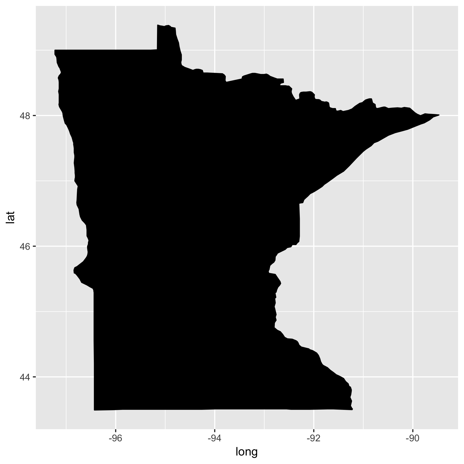
1 2 3 | mn_3d <- ggplot(data = mn_df, mapping = aes(x = long, y = lat, group = group)) + geom_polygon(color = "black", fill = "black") |
This gives us just the rough outline for the state of Minnesota
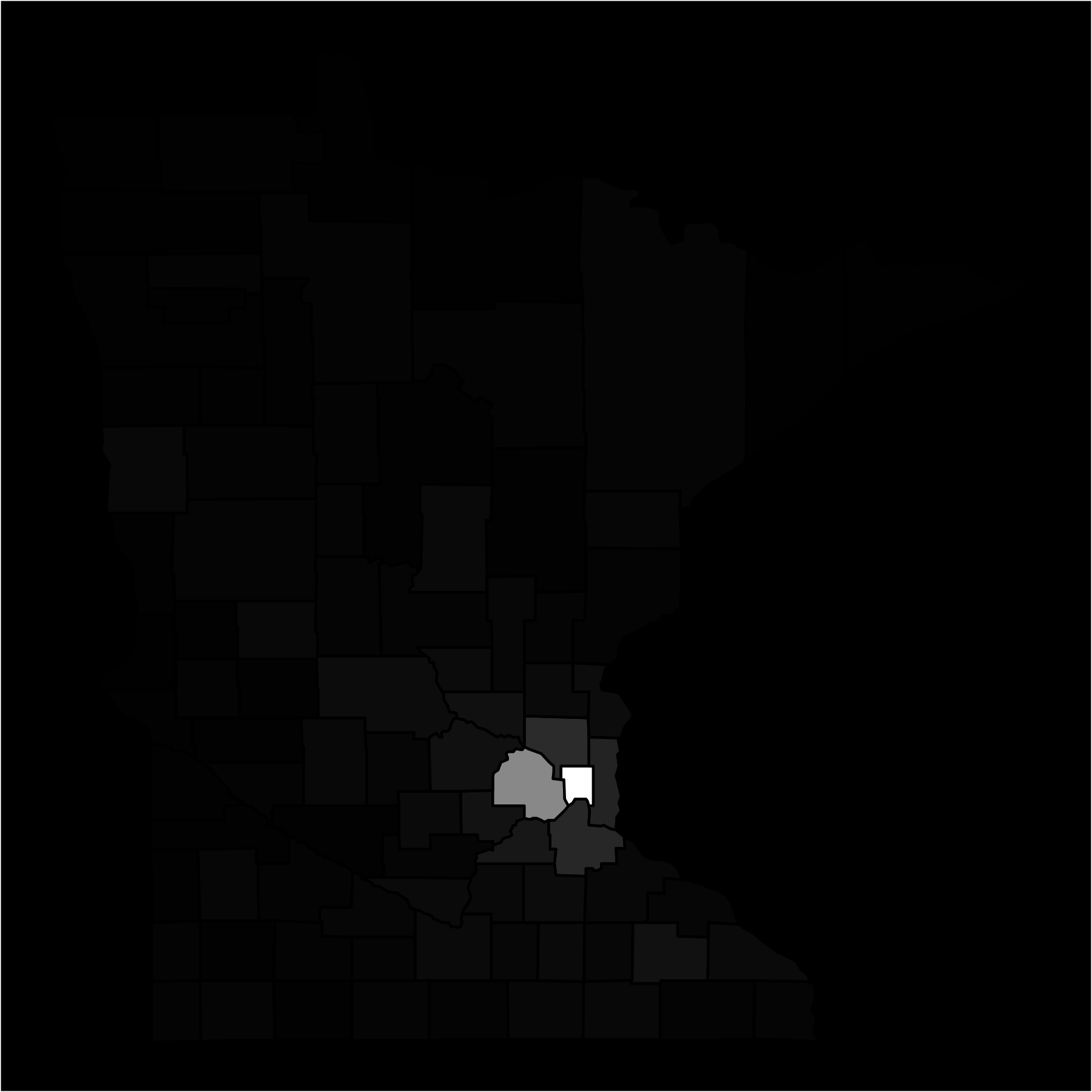
Plot the elevation using the county density.
1 2 3 4 5 6 7 8 9 10 11 | mn_3d <- mn_3d + theme_nothing() + theme(plot.background = element_rect(fill = "black")) + geom_polygon(data = mn_county, aes(fill = density), color = "black") + scale_fill_continuous(low = "#010101",high = "white") + theme(legend.position = "none", axis.ticks = element_blank(), panel.grid = element_blank(), axis.text = element_blank()) + geom_polygon(color = "black", fill = NA) + labs(fill = "") + theme(plot.background = element_rect(fill = "black")) mn_3d |
Save the plot, make sure to use the same dimensions for both elevation and color overlay.
1 2 | ggsave(filename = "elevation-2d.png", plot = mn_3d, width = 6, height = 6) |
Generating Color Overlay
This is where the limits come into play.
1 2 3 4 5 6 7 | mn_gov <- mn_3d + geom_polygon(data = mn_county, aes(fill = margin), color = "black") + scale_fill_continuous(limits = c(-.3,.3), low = "#BD0000", high = "#0040B8", space = "Lab", na.value = "grey50", guide = "colourbar") + theme(plot.background = element_rect(fill = "#FFFFFF")) mn_gov ggsave(filename = "MN-Governor.png",plot = mn_gov,width = 6, height = 6) |
Convert Plots to Matrix Values
1 2 3 4 5 | raster::raster("elevation-2d.png") -> localtif # And convert it to a matrix: elmat <- matrix(raster::extract(localtif,raster::extent(localtif),buffer=1000), nrow=ncol(localtif),ncol=nrow(localtif)) |
For some reason ggplot seems to keep a bit of a border when using ggsave, so we will need to trim off a little from the matrix.
1 2 3 | > dim(elmat) [1] 1800 1800 |
I chose to trim by 10 on every side, for both elevation and color overlay.
1 2 | elmat <- elmat[11:(nrow(elmat)-10),11:(ncol(elmat)-10)] |
Now we get this
1 2 3 | dim(elmat) [1] 1780 1780 |
Do the Same for Color Overlay
1 2 3 4 5 | ecolor <- readPNG("MN-Governor.png") ecolor <- ecolor[11:(nrow(ecolor)-10),11:(ncol(ecolor)-10),1:4] # Set the alpha value on 4th dimension (RGBA) ecolor[,,4] <- .9 |
The Payoff
Here it is, the final piece from Rayshader. If you just want the elevation, remove the line for add_overlay().
1 2 3 4 5 6 7 8 | elmat %>% sphere_shade(progbar = FALSE,texture = "bw") %>% add_overlay(overlay = ecolor) %>% add_shadow(ray_shade(elmat,zscale=4000,maxsearch = 300,progbar = FALSE),0.7) %>% plot_3d(elmat, fov=30, theta=45, phi=25, windowsize=c(1024,1024), zoom=0.4, water=FALSE, waterdepth = 10, waterlinecolor = "white", waterlinealpha = 0.5, wateralpha = 0.8,watercolor = "lightblue") |
Rendering the water by changing that flag can be a good way to segment or filter out low density counties.
Some Useful Commands
1 2 3 4 5 6 7 8 | library(rgl) # Render Viewport to File rgl.snapshot("MN-Election-Results-Water.png", fmt = "png", top = F) # Render Viewport with Simulated Depth of Field to Plot Viwer render_depth(focus = .5, focallength = 85, fstop = 4) # Render GIF (Can Take a While) movie3d(spin3d(axis = c(0, 1, 0), rpm = 4), duration = 15, dir = getwd(), movie = "render") |

This is excellent. Thank you for posting.